Do you struggle when using certain colors for your cards? I am a pink and blue kind of girl. I love those colors and have no trouble figuring out pleasing color combinations. But yellows, oranges and greens are not my thing. I don’t usually wear those colors and sometimes I struggle to use them in my projects. Mango Melody is that kind of color. To me it seems too bright and bold to look “nice” on a card. Maybe for kid cards, where I would want really bright colors, but that (and sunsets/sunrises) are really the only time I would use it.
While playing with my blending brushes today, I decided to use Mango Melody on my project. I had already used it on my brush for a different project (sunset), so I pulled it out. I liked the pattern that I created, but had no idea how to use it on a card. So, I did what we all do when we don’t know something. I pulled up Google. I searched for Mango Melody color combinations. Lots of options came up and I found one that I liked.
The finished project was amazing!
I absolutely LOVE this card. It is so classy and clean looking!
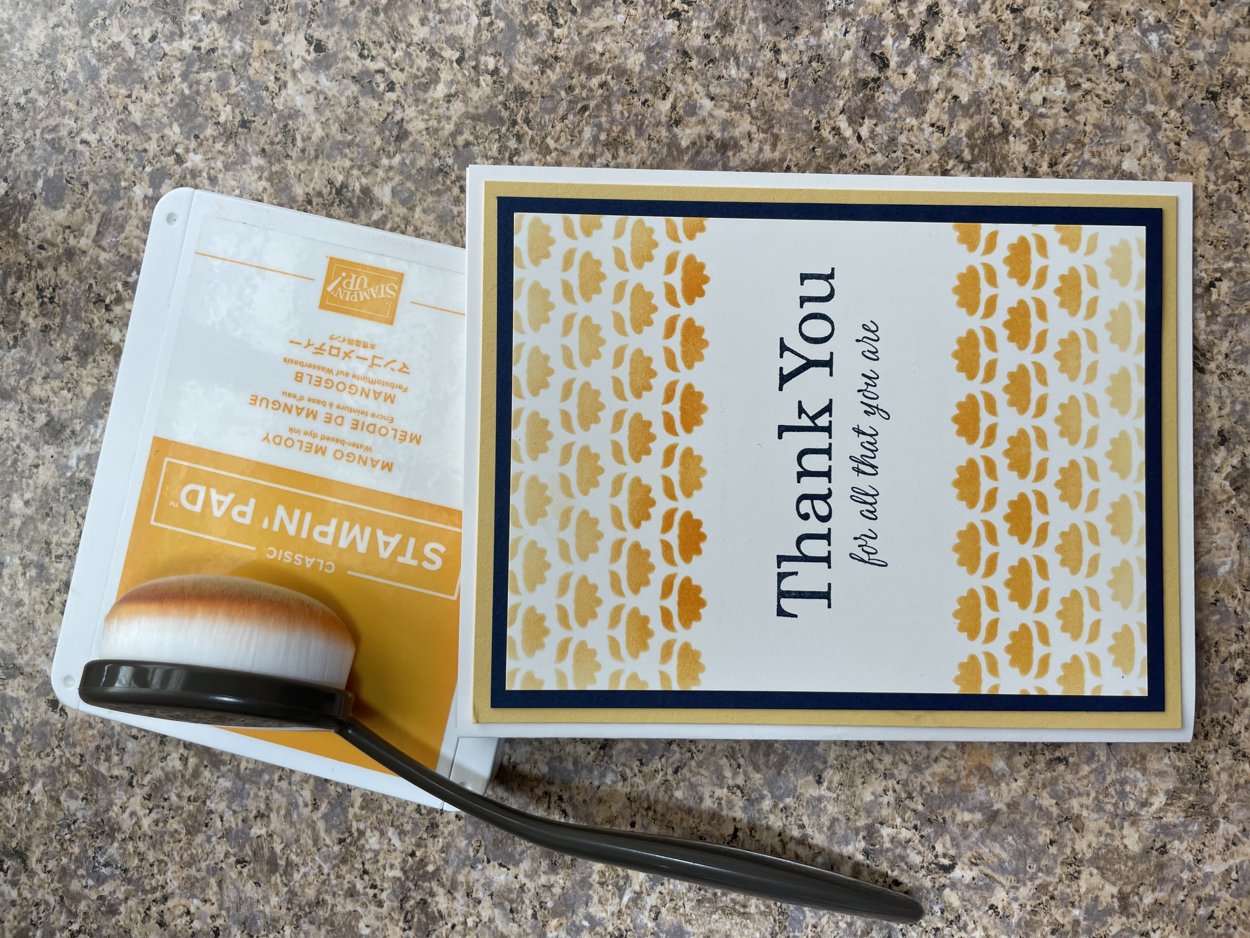
This color combination is Mango Melody, So Saffron and Night of Navy. Isn’t it beautiful?! I just can’t stop admiring it! 😉 Out of curiosity I checked out the color wheel. Sure enough, this yellow orange color and dark blue are complementary colors on the color wheel.
If you get stuck trying to figure out a color combination, google it or look at a color wheel. Like me, you might be surprised at the outcome. Tomorrow I am sharing another source for color combination inspiration. Be sure to check back and see what that one is too!
Product List


")